More and more mobile devices feature a notch (or display cutout, as it is called on Android). To handle this little monster, mobile app developers now face many new challenges.
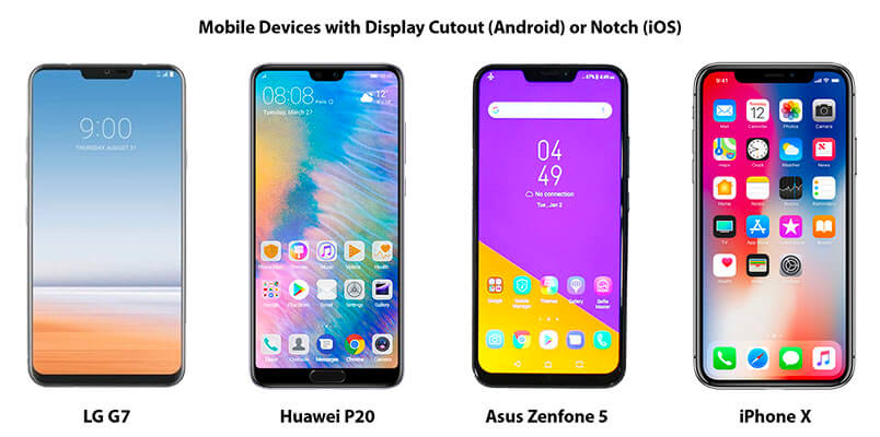
The trend is spreading fast and many manufacturers already announced new 2018 models with edge-to-edge screens. For example with Android P devices like Essential Phone, OnePlus 6, Oppo R15 Pro, Vivo X21, LG G7, Huawei P20 or Asus Zenfone 5. Similar to the iPhone X, Apple’s new iPad Pro model, the iPad X, will also include a notch and feature Face ID.
“How hard can it be to support the notch – maybe one or two days to optimize existing apps for it?”
That’s what we initially thought. As it turned out, it was a lot harder than expected. We ran into many bumps along the road of porting 20+ apps & games to properly support it.
As a native iOS and Android developer, you will experience similar issues yourself when you start to develop for devices with edge-to-edge screens. For iOS, Apple even requires you to support iOS 11 and the notch: All new apps & app updates submitted after July 2018 get rejected otherwise.
So we put up our sleeves and prepared this guide to show you how to support the notch in your apps. Thus the sooner you start following this guide the better you are prepared for the Apple change coming in July and for upcoming Android P changes.
The tips provided in this guide apply for both iOS and Android and are useful for cross-platform developers as well. Along the way, we also modified all the components in Felgo, a cross-platform framework for app & game development. It now supports the notch out-of-the-box, so you don’t need to go through this „notch hell“ yourself. 🙂
Here we go! We hope you enjoy the „Ultimate Guide to Survive the Notch“:
- User Interface Challenges of Devices with Edge-to-Edge Displays
- How to Create iPhone X Apps with Xcode
- Android P Developer Preview: Display Cutouts
- Save Time and Effort with Felgo Engine for Mobile Apps
- More Free App Developer Resources
- The Best App Development Tutorials & Free App Templates
- App Development Video Tutorials
User Interface Challenges of Devices with Edge-to-Edge Displays
Many manufacturers already announced new models with edge-to-edge screens, which became even more popular after the release of the iPhone X:
Such screens allow to get the most out of the available space the device offers. In addition to the rounded edges, there is a main pain point for mobile app developers: the notch.
Instead of a clear rectangular frame, app developers now face arbitrary shaped screens. Also, hardware buttons at the front no longer exist. They got replaced by on-screen buttons and gestures provided by the OS. The following sections describe how to create adaptive layouts to handle those challenges for both iOS & Android. While this post uses examples for iPhone X, the same concepts and suggested solutions also apply for other devices & platforms with similar screens, like upcoming Android P devices.
Use Felgo’s iOS and Android app development services, in case you need help with that.
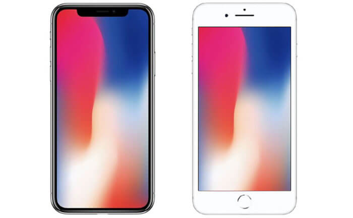
Bigger Screen Size and Safe Area of iPhone X
For the iPhone X, the new screen holds two major factors to account for in your mobile app:
- The screen is bigger in general, so there’s more space your app can use.
- Your app content should not cover areas with a notch or native on-screen buttons. Otherwise, the elements you place at these parts of the screen are not accessible.
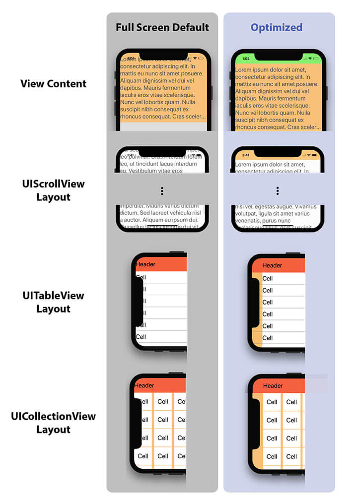
To support different device models and screens, most apps use a responsive layout. This means that the pages use the full height and width to show as much content as possible. This is a good thing. But if the notch and reserved areas are not taken into consideration, some parts of your app are covered or inaccessible.
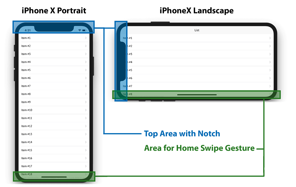
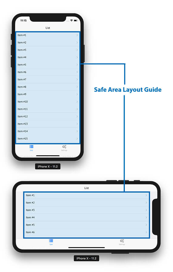
In the example screenshots shown above for the iPhone X, the notch covers the top navigation bar in portrait mode and your page content, the list item text, in landscape mode. For both orientations, the area for the home swipe gesture overlays your app at the bottom. Also note that the new screen comes with rounded corners.
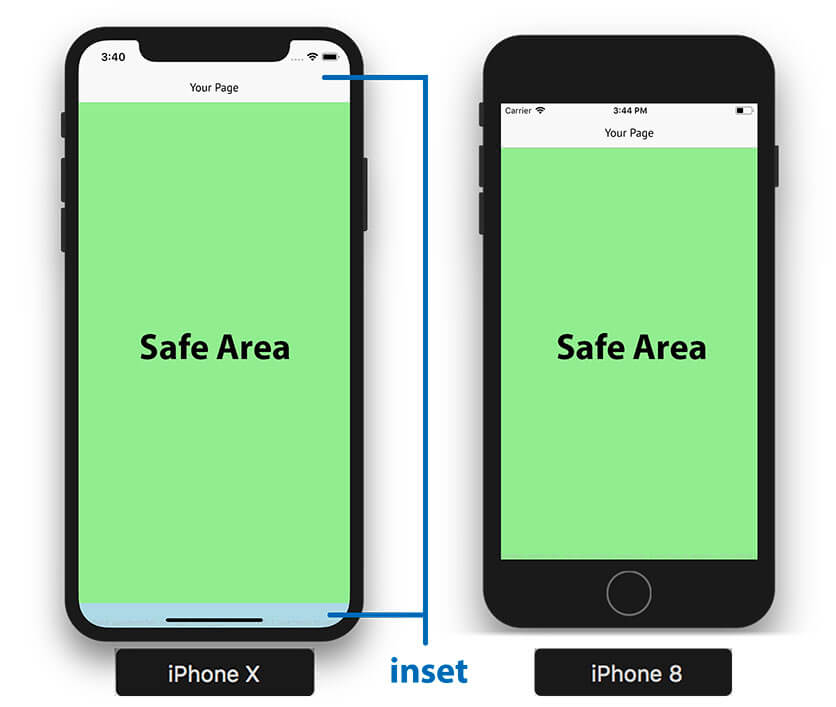
To solve this problem, your app needs to consider the safe area of the screen. It is the part of your app, which won’t be covered by the notch or on-screen gestures. The required top and bottom screen insets determine the safe area in portrait mode:
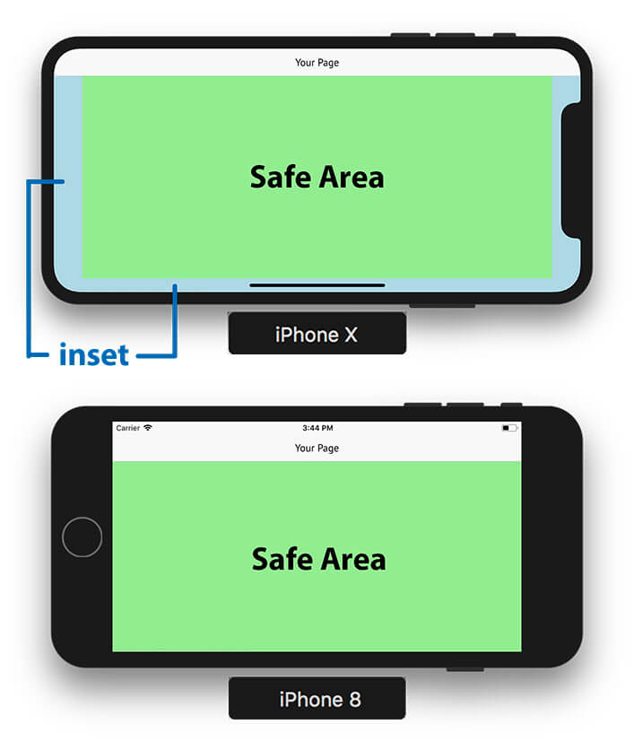
For example, the navigation bar requires more padding at the top to be within the safe area. In landscape mode it looks a bit different. We then require margins to the left and right (for the rounded corners and the notch), as well as a small inset at the bottom (for the home swipe gesture):
How Do Existing Apps Look on iPhone X?
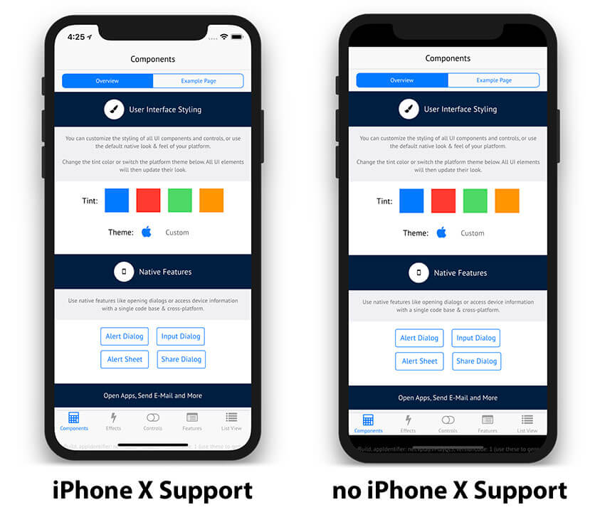
If you are worrying that your published app is already affected by the notch, you can relax. Only apps configured to target iPhone X will run full-screen. Your existing iOS apps will come with black borders as shown on the right in this image, to not overlay areas with a notch or screen gestures:
The disadvantages are that the borders do not look good and the app does not match the style of other iPhone X apps – your user’s will realize this and your app will get a worse rating. The black border fallback is simply a backwards compatibility feature by Apple to not break anything. However, it also means some work for us app developers to support the new screen.
How to Create iPhone X Apps with Xcode
Enable iPhone X Support for Your App
Unless your app enables support for iPhone X, it will show with black borders by default. This also means, that your existing apps won’t be affected by the notch. However, if you want to fully support iPhone X and let your app fill the whole screen, you need to add an additional launch image for the iPhone X resolution in Xcode:
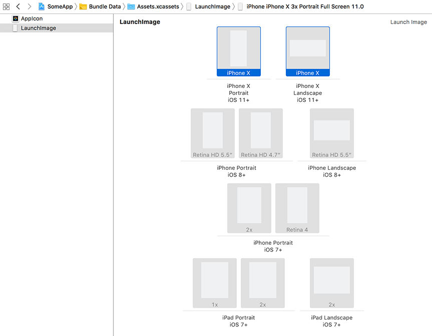
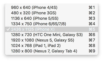
Add one image with 2436 x 1125 pixels for landscape mode, and one with 1125 x 2436 pixels if you want to support portrait.
Position Your Content to the Safe Area Layout Guide
Many iOS apps use a navigation bar at the top and a tab bar at the bottom. With iOS 7, Apple decided to add the topLayoutGuide and bottomLayoutGuide properties, which match the insets for these bars in the view. Developers can thus align their content to match these insets.
For iPhone X, it is not enough to only take care of the top and bottom margins. We also have insets to the left and right of the screen, e.g. when in landscape mode. So Apple introduced the new safeAreaLayoutGuide property with iOS 11. The top and bottom layout guides are now deprecated.
To make sure your content isn’t covered by the notch, position it to the safe area layout guide. Similar to the previous top and bottom layout guides, this can be done with constraints.
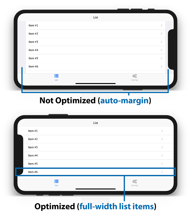
But this simple solution is still far from perfect. Especially in landscape mode, constraining your content area can leave some ugly margins. To avoid this, you can instead add custom insets to your content only where necessary.
The new safeAreaInsets property gives access to the exact pixel inset for the safe area. You can thus tweak the layout to look exactly as you want. For example, you can design the cells of your list items to account for the safe area with a bigger indent. The view content can then cover the whole screen.
How to Migrate Existing Native iOS Apps to work with Safe Area Insets
To make updating your apps a bit easier, you have the option to activate the Use Safe Area Layout Guides setting for each of your Storyboards in Xcode.
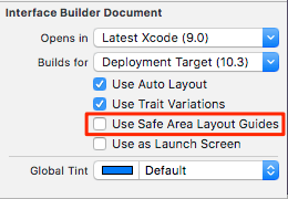
The Storyboard then replaces the top and bottom layout guides with a safe area and updates the constraints. This is a quick first measure to get your app ready for iPhone X.
But as mentioned above, you will still need to check all your views to provide the best possible user experience. For example, to:
- Let the background of a sub-view use the full screen while keeping the content safe.
- Decide how to handle the insets when flicking a UIScrollView.
- Set up your UITableView or UICollectionView to correctly layout for iPhone X.
Also, you might not be happy with the result of the default Use Safe Area Layout Guides setting in case your app hides the system status bar:
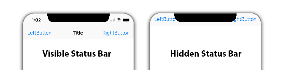
Due to a bug within the latest iOS 11 SDK, the navigation bar does not account for the notch in this case. Except for some workarounds, there is no simple solution for this issue at the moment of writing this guide. At least when relying on native iOS development with Xcode.
Android P Developer Preview: Display Cutouts
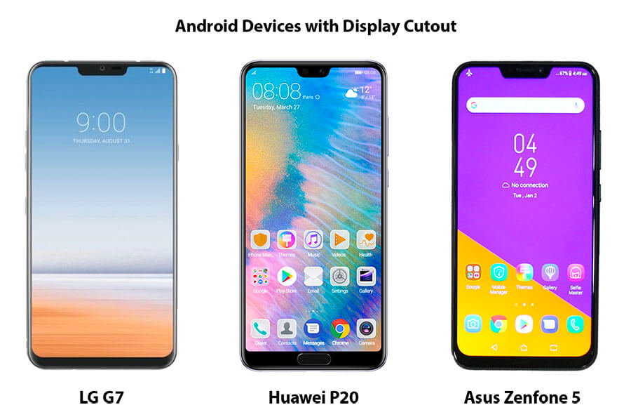
Many Android phone manufacturers already announced their upcoming device models with edge-to-edge displays and rounded corners. For example:
Google also already released the developer preview for Android P. It comes with the ability to handle these so-called display cutouts. In the iOS world, display cutout is equivalent to notch.
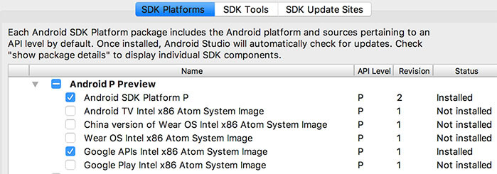
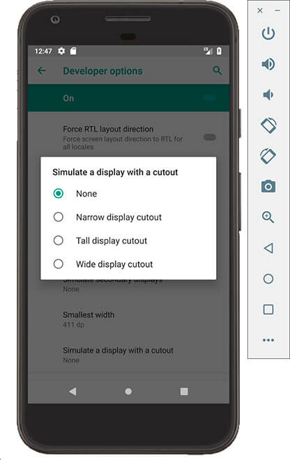
How to Test Apps with Display Cutout in Android P
The Android P Developer Preview allows simulation of display cutout. Android P is available with the SDK Manager of Android Studio. It is sufficient to install the Android P SDK and System Image to test on a virtual Android P device:
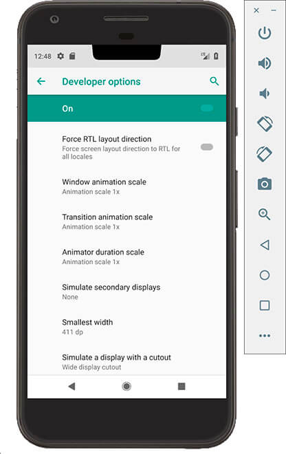
After installation is complete, you can start an emulator running Android P. The developer settings on Android P offer four different display cutout options to choose from:
After selecting this option, the Android device will show with a bigger status bar that also includes a display cutout:
The layoutInDisplayCutoutMode attribute controls how the window is laid out if there is a display cutout. By default your Android P app never extends into cutout areas – with a single exception. As visible on the image above, your app can safely cover the full screen for cutouts that do not exceed the status bar area.
Note: The window will lose this ability to extend into the cutout area when FLAG_FULLSCREEN or SYSTEM_UI_FLAG_FULLSCREEN is set.
To let your app always take advantage of the full screen, you can set the value LAYOUT_IN_DISPLAY_CUTOUT_MODE_ALWAYS. You are then responsible to keep your app content within the safe area of the screen. For example, when the device is in landscape mode or if the cutout exceeds the status bar in portrait.
Custom Layouts with Safe Area Insets in Android P
Like iOS 11, Android P includes features to determine the safe area of the screen and work with the given insets. The new DisplayCutout class lets you find out the location and shape of the non-functional areas where content shouldn’t be displayed.
To determine the existence and placement of the cutouts areas, use the getDisplayCutout() method. You can then access the following fields for the DisplayCutout:
- getSafeInsetBottom() – Returns the bottom safe area inset of the screen.
- getSafeInsetLeft() – Returns the left safe area inset of the screen..
- getSafeInsetRight() – Returns the right safe area inset of the screen..
- getSafeInsetTop() – Returns the top safe area inset of the screen..
- getBoundingRects() – Returns a list of Rect objects that describe non-functional areas of the screen.
Overall it means quite some work to let your app layout adapt to these new displays. Especially for developers that target both iOS and Android.
Save Time and Effort with Felgo Engine for Mobile Apps
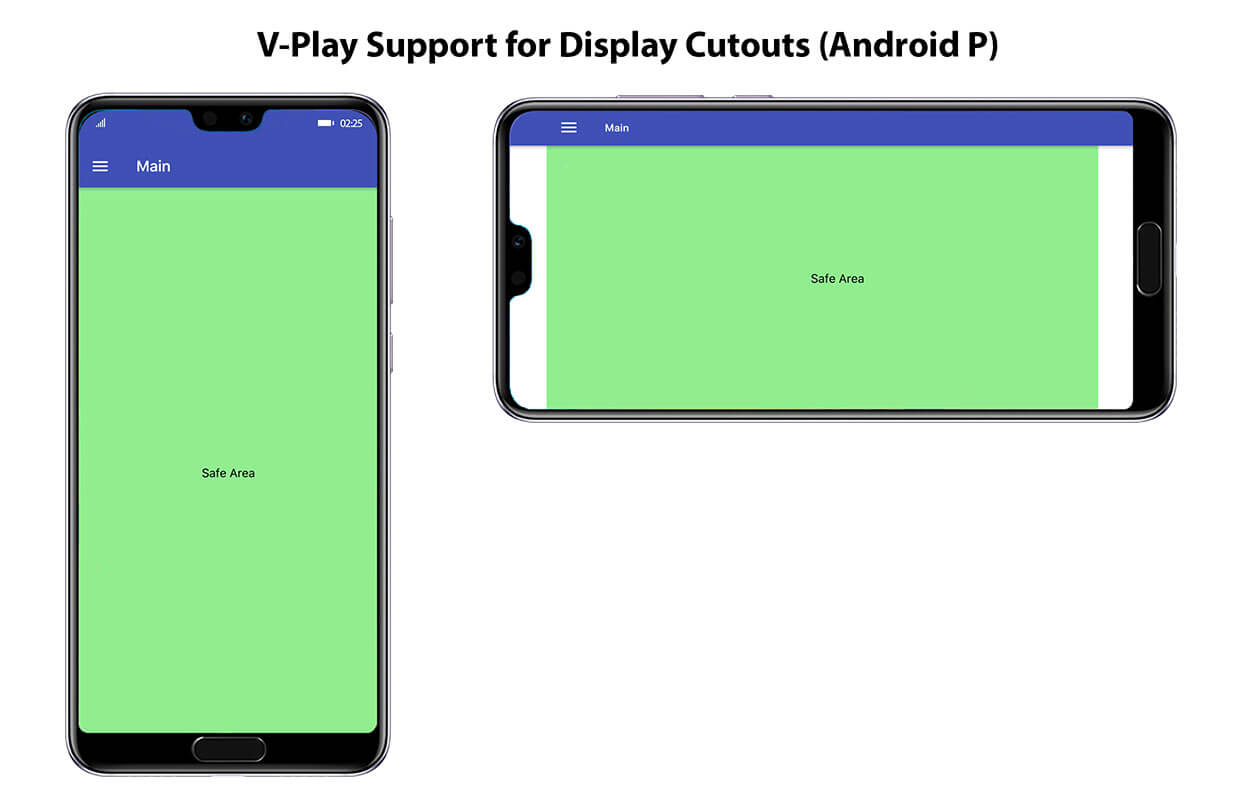
Create iOS and Android Apps that Support The Notches and Display Cutouts
Felgo Engine focuses on making mobile app development easy. And it also supports the iPhone X notch and Android P devices with display cutouts out-of-the-box. You can write your app once, and build for iOS, Android or even Desktop with a single button press from 1 IDE. The source code is 100% shared across all platforms.
Felgo builds upon C++ & Qt and utilizes QML & JavaScript. QML is a fast and easy-to-use declarative UI language. With only a few lines of code, it is possible to create native iOS and Android apps that look native on every device:
import Felgo 3.0
import QtQuick 2.0

App {
  // adds tab navigation (iOS) or drawer menu (Android)
  Navigation {

    // first tab
    NavigationItem {
      icon: IconType.home
      title: "Main"

      // main page
      NavigationStack {
        Page {
          title: "Main"

          Rectangle {
            anchors.fill: parent // Rectangle fills whole Page
            color: "lightgreen"

            AppText {
              anchors.centerIn: parent // AppText is centered on Page
              text: "Safe Area"
            }
          }
        }
      }
    }

    // second tab
    NavigationItem {
      icon: IconType.gears
      title: "Settings"

      // settings page
      NavigationStack {
        Page { title: "Settings" }
      }
    }

  }
}
This is how the above example app looks like on an iPhone X:
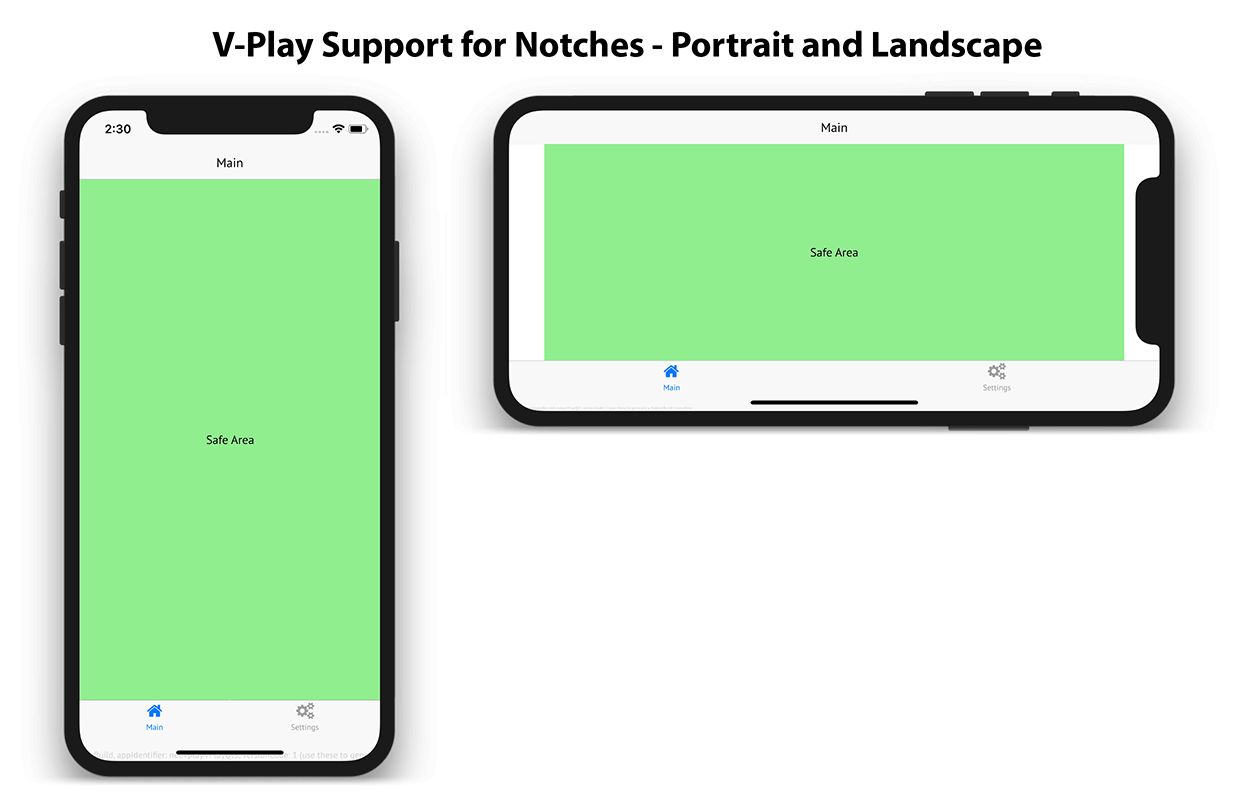
The used components like Navigation and NavigationStack are prepared to work with safe area insets: They automatically include extra margins for the tab and navigation bar if required.
In contrast to the native iOS SDK it is also possible to hide the status bar without any issues. You can do this by setting a single property in your code:
import Felgo 3.0
import QtQuick 2.0

App {
  onInitTheme: {
    Theme.colors.statusBarStyle = Theme.colors.statusBarStyleHidden
  }

  // main page
  NavigationStack {
    Page {
      title: "Main"

      AppButton {
        anchors.horizontalCenter: parent.horizontalCenter
        text: "Toggle Status Bar"
        onClicked: {
          if(Theme.statusBarStyle !== Theme.colors.statusBarStyleHidden)
            Theme.colors.statusBarStyle = Theme.colors.statusBarStyleHidden
          else
            Theme.colors.statusBarStyle = Theme.colors.statusBarStyleBlack
        }
      }
    }
  }
}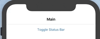
The top navigation bar in Felgo always supports the notch automatically, even with a hidden status bar.
Like the Use Safe Area Layout Guide setting for Xcode Storyboards, the content of your pages does not overlap reserved areas of the screen. But Felgo requires no extra setting to achieve this. The page content aligns with the safe area out-of-the box. For devices without a notch, the app does not show any extra margins or insets:
Note: Configure iPhone X launch images for your iOS app to get full-screen support on iPhone X if you have an existing Felgo app. For new apps, this is set up automatically.
Optimize your User Interface with Adaptive Layouts
For most use cases, the default settings are fine to let your app look good on devices with and without display cutouts. If you want more control over how to display your content, you can disable the useSafeArea setting of each Page. You then have two options to work with the safe area:
- Configure only certain content items within the Page to align with the safe area.
- Retrieve the exact safe area inset of the screen and layout items as required.
The following example deactivates the useSafeArea setting and shows both options:
import Felgo 3.0
import QtQuick 2.0

App {

  Page {
    useSafeArea: false // the page content can use all available space

    // fill whole page/screen with blue color (background)
    Rectangle {
      anchors.fill: parent
      color: "lightblue"
    }

    // Option 1: fill only safe area with green color (content)
    Rectangle {
      anchors.fill: parent.safeArea
      color: "lightgreen"
    }

    // Option 2: adaptive background to cover top inset area (or status bar area on devices without insets)
    Rectangle {
      width: parent.width
      height: nativeUtils.safeAreaInsets.top > 0 ? nativeUtils.safeAreaInsets.top : nativeUtils.statusBarHeight()
      color: "yellow"
    }
  }

}
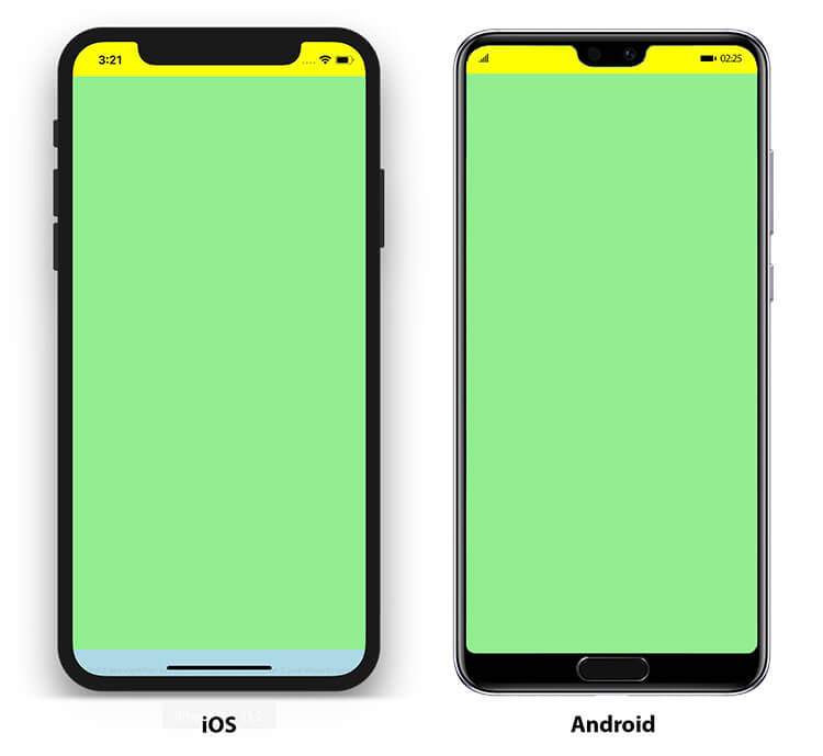
The page content can now cover the full screen by default. You can use the safeArea property of the Page to align items with the safe area of the screen. In the above example, we use this to fill the safe area with a green rectangle. This is where you can place your content items.
The nativeUtils.safeAreaInsets hold the exact safe area insets of the screen in pixels. Devices without a notch do not have any insets and thus return 0. For iPhone X, the yellow rectangle will cover the top inset, which includes the status bar. To also support older devices, you fill the status bar if no inset is returned by nativeUtils.safeAreaInsets.top.
The available safeAreaInsets properties are:
- nativeUtils.safeAreaInsets.top
- nativeUtils.safeAreaInsets.right
- nativeUtils.safeAreaInsets.bottom
- nativeUtils.safeAreaInsets.left
Running this app on iOS or Android produces the following result:
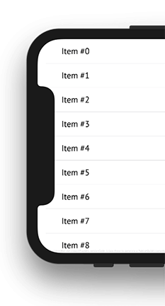
Developing adaptive user interfaces this way is very convenient. The following example shows how you could use nativeUtils.safeAreaInsets.left to add more indent for the cells of a list.
import Felgo 3.0
import QtQuick 2.0

App {

  NavigationStack {
    ListPage {
      title: "List Page"
      useSafeArea: false // the page fills all available space
      model: 50 // quick way to populate the list with 50 items

      // UI for cells of the list
      delegate: SimpleRow {
        text: "Item #"+index

        // set indent of the cells
        // matches the safe area inset or minimum 16 dp (if no inset required, e.g. in portrait mode or on older devices)
        style.indent: Math.max(nativeUtils.safeAreaInsets.left, dp(16))
      }
    }
  }

}
With such simple additions, you can make sure that your app looks pixel-perfect on screens with and without safe area insets.
You don’t need to add such tweaks for apps that offer the default UI with a navigation bar and tab bar. The Felgo page and navigation components look good on all devices and adapt their style automatically.
Support for Display Cutout on Android P Devices
Felgo Engine is a cross-platform development tool that supports both Android and iOS. You can take the QML code of your iOS app and directly build for Android, or vice-versa. All components change their look and behavior then. They match the native style and user experience of the given platform:
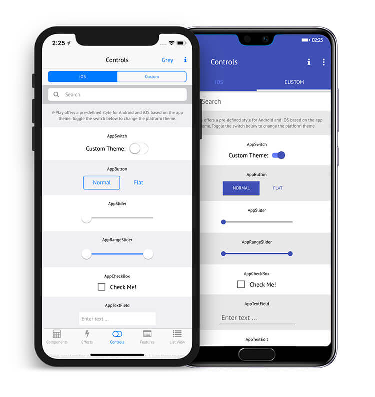
The above image shows the Android and iOS style for the same example app. The Android style is already prepared to support edge-to-edge screens. No extra work is required, to make your app work cross-platform for iOS & Android with display cutouts, safe area and a notch!
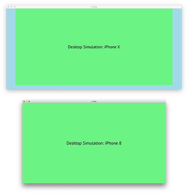
Simulate Safe Area Insets while Developing on Desktop
It takes quite some time to always build and deploy to your phone or the simulator. With Felgo you can run and test your app directly on Desktop. It is even possible to simulate different devices and resolutions to see how your app will look like. You can change the resolution at runtime, without having to restart your app. This is a huge time-saver for UI development & testing! Native development for Android or iOS requires deployment to another real or virtual device to test the UI.
Along with the support for a display notch, Felgo also comes with a new resolution simulator entry for iPhone X. And the best thing is: It even covers the safe area insets you get on a real device:
Felgo Engine is thus a huge time-saver when developing for iOS and Android. The Felgo SDK is free to use, so make sure to check it out!
More Relevant App Development Resources
- How to Create Mobile Games for Devices with Safe Areas like iPhone X
- How to support multiple screen sizes & screen densities – Responsive App Guide
- Guide for App Layout
- Guide for App Navigation
- iPhone X Human Interface Guidelines
- iOS Documentation: Positioning Content Relative to the Safe Area
- Safe Area Development Guide for iOS
- Layout Guide, Margins, Insets and Safe Area demystified on iOS 10 & 11
- Exploring Android P Display Cutouts
The Best App Development Tutorials & Free App Templates
All of these tutorials come with full source code of the mobile apps! You can copy the code to make your own apps for free!
- How to create a mobile app for iOS & Android with a single code base
- How to support multiple languages and internationalization in your mobile app
- Common Widgets & Controls in a cross-platform App
- How to add native code to your mobile App
- How to easily style your App with Themes
- How to add Animations to your App
- How to add a Chat to your Mobile App
- How to make a Weather App accessing a REST weather service
- Conference App Template
- Widget Gallery App Template
- Twitter App Template
- Messenger App Template
- Property Finder App Template
App Development Video Tutorials
Thanks for reading & scrolling that far! 🙂
Do you have suggestions for posts or tutorials about app development?
Simply send us a message which tutorial you’d like to see here.
More Posts Like This
How to Make Cross-Platform Mobile Apps with Qt – Felgo Apps
Release 2.16.0: iPhone X Support and Runtime Screen Orientation Changes