Accessibility in mobile development means making apps and games for people with different sets of abilities.
People that make use of accessibility features in apps and games include those with hearing or visual impairments, motor impairments and cognitive impairments.
Thankfully, there are guidelines in place to cater to the needs of these users. These guidelines allow users to interact with your app or game intuitively. The guidelines differ from platform to platform but with a cross-platform approach, accessible app and game design is simplified for developers.
Developers also benefit from accessible design as it makes apps and games available to a wider audience and creates a more engaging user experience for your existing user base. So find out how to make your app or game more accessible to a diverse audience and see the results for yourself.
Accessibility Tips for the Visually Impaired
Users with visual impairments include those with no or limited sight, but also those with different degrees of colorblindness. Check out these tips to make your app or game more accessible to those with visual impairments.
1. Use Appropriate Colors
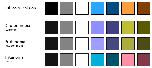
Colorblindness is a lot more prevalent than you may think. It’s estimated that between 8-10% of males suffer from problems perceiving red or green. This is a large selection of the population and means that one of your users will struggle with colors in your project at some point.
Whether you’re working on your UI design or a new game feature, remember that color isn’t enough to distinguish it from the rest of the project. Use text, symbols or shapes to highlight the function of buttons within your UI.

2. Pick the Right Font Type & Size
You can make things a lot easier for users with long-sightedness or other visual impairments by using an appropriate font size. Although Apple and Google offer guidelines on minimum font size in their best practices, you might want to increase this number when considering those with different abilities.
It’s also important to remember that using a consistent font throughout your application will make it much easier for your eyes to stay adjusted. This will save your eyes from having to work so hard, making the app more enjoyable.
Wherever possible, use simple text formatting to convey your message. Any classic font against a plain background can be read with ease. Remember that the next time you want to explore fonts!

There are some cognitive benefits to using a well-sized font too. It’s much easier for dyslexics to read a well-sized simple font as the letters are not as close together. If you can get your font size correct, then it should be easy to make the rest of your app or game accessible too.
3. Pay Attention to Buttons
Buttons can be the hardest part of engaging with an app or game for the visually impaired. Some of the problems that users encounter include buttons being too small to press or buttons being too close together.
As with font size, both Google and Apple provide best practices for button design and minimum button sizes. You can use these guidelines to begin with and then make improvements from there.
Buttons should never be close together, but if you absolutely need to have buttons close together, make sure they’re big enough to compensate for the tight contact area.
Flappy Bird is considered an industry standard when it comes to button placement and size. You can check out the Felgo version of Flappy Bird here!
Accessibility Tips for the Hearing Impaired
Users with hearing impairments include deaf people, as well as people with partial hearing or hearing loss in one or multiple ears. There are a number of other hearing disorders but these are the main ones we can combat with accessible design
4. Implement Volume Controls
While apps can be rich in UI sounds or used to play multimedia such as songs and videos, mobile games tend to require more listening attention.

Between the in-game soundtrack, UI sounds, and in-game dialogue, there are a lot of obstacles that the hearing impaired need to overcome to get the full user experience of a mobile game.
One simple way to make your mobile game more accessible is by enabling individual volume controls for all of the different types of sound featured in your game. This way, your players can determine what is most important for them to hear when playing your game.
Depending on your game, it may be necessary for a user to mute the game soundtrack or increase the volume of UI sounds in order to get the full enjoyment of your game. By giving them the choice of what they hear, you can make your app or game more accessible to those with hearing impairments.
5. Combine Audio and Visual Cues
Many apps and games make use of audio cues to tell users when they’ve received a notification or made an in-game discovery. Unfortunately for the hearing impaired, these cues can often go unnoticed.
That’s why it’s always important to give these cues in more than one way. In order to make your app or game more accessible to both the visual and hearing impaired, make sure to combine your audio cues with a visual cue, and vice versa.
You visual cue can be something as simple as a text description of what’s happening or an animation that clearly shows something of note has occurred.
By combining audio and visual cues, you increase the amount of engagement that the hearing impaired can have. It’s a simple technique for a simple problem but that extra accessibility is sure to lead to a more positive user experience for many of your users.
Learn how to Acquire New Users for your Application HERE
6. Provide Subtitles When Necessary
If your mobile game features a backstory or shows some kind of character interaction, make sure to include subtitles for the hearing impaired.
Subtitles are easy for developers to include and are one of the most well-established accessibility features in modern society. Whether it’s TV, live performance or an ATM, subtitle implementation is a well-documented art form that doesn’t need to distract from your app or game.

Remember to use a legible font size, clear text formatting and make sure the font and background color contrast heavily. Subtitles have been a part of mobile gaming since the Nintendo GameBoy so there are plenty examples for your to look at and draw inspiration from.
Accessibility Tips for People with Motor Impairment
Motor impairment exists in 3 forms.
There are people with permanent motor impairment meaning they can never move a certain part of their body. People with temporary motor impairment include those that have injured a limb or other body part, and now have limited movement until the injury heals.
Finally, there are players with situational motor impairment. This means they’re motor impaired for a short time period, possibly because they’re carrying another object or their location prevents full access to their device.
In any case, there are a number of techniques you can employ to make your app or game more accessible to the motor impaired.
7. A Universal Input Method
When designing your app or game, it’s important to consider the different ways that a user can physically interact with your UI elements. Mobile devices now allow for a number of different gestures. However what might be a simple swipe or double tap for you, might present a dead end to users with motor impairments.

This is why it’s important to have a universal input method when using your app or game. This might mean adding extra on-screen buttons to allow one-tap navigation. But it also means that your app or game will be accessible to all users.
Test out your next app or game and see if you can navigate and even play your game with one finger. If you get stuck on a screen or need to restart the app to find the home screen then you need to find a universal input method to make your project accessible.
8. Allow for Sensitivity Adjustments
Once you’ve found your universal input method, the next step in making your app or game more accessible is to allow for sensitivity adjustments.
Depending on a user’s motor impairment, they may need to have more or less sensitive controls than you have decided upon. By allowing users to set the sensitivity of controls, you allow them to replicate the user experience of users without their impairment.
There is no perfect level of control sensitivity, even for users without impairments, so this is a crucial accessibility feature for almost everyone. To give users the most options, make sure that the sensitivity can be adjusted to compensate for problems with both precision (low sensitivity) and restricted movement (high sensitivity).
9. Make Your Controllers Big
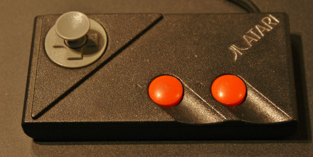
As many mobile gamers first started playing on game consoles with traditional D-Pad controllers, they adapt well to a similar input method on their mobile devices. It’s a proven system and one that works well for the majority of gamers.

Players with motor impairments won’t thank you for making on-screen buttons the same size as they are on a physical controller. Give them big buttons with enough space in between them so they can get the full user experience. Felgo has a useful controller component that you can quickly implement into your own game.
Accessibility Tips for People with Cognitive Impairments
Cognitive impairments cover a vast range of impairments that can include memory loss, problems navigating systems and low level reading ability. These issues can be overcome with the help of the following guidelines.
10. Quick Game or Quick Start Mode
For sufferers of dyspraxia and other similar conditions, it can be hard to set up a game that requires a number of choices to be made beforehand. Picking a team, character, color, etc., can become an issue for players with these issues, so it’s better if these decisions can be avoided.
The best way to achieve this is by enabling a quick game or quick start mode in your game. This allows players with these impairments to engage easily with your game. Even if you never intended for your game to be played this way, you can still benefit from the engagement this will create within your app or game.
11. Use Clear Language
The use of clear language within your app or game for both UI elements and gameplay is a major factor in creating an accessible project. Besides dyslexia, you’re also going to have a lot of users from foreign countries and native speakers with low-level reading abilities trying to navigate your app or game.
By using clear language, you reduce the risk of users becoming disengaged. The simplest way to ensure the language you’re using is clear and easy to understand is to try and reduce the amount of words you use. If you can relabel a button so it’s only using 1 word instead of 3, then you’re on the right road to accessible design.
If you’re unable to reduce the amount of words you use, then try to reduce the amount of characters you use. When it comes to reading; always keep things as simple as possible.
12. Let Players Control Text Prompts
If you’re game is going to have sections that require reading, it’s important that you let players with cognitive impairments read at their own pace. Let them decide when to show the next piece of text and you’ll have made things much more accessible for them.

Image Via YouTube
Much like the issue of sensitivity control, this is a matter of design that affects even the unimpaired. Significant differences in reading speed exist between players of all age brackets. This makes automatic scrolling a poor choice in any case.
As well as letting players decide when they read the next piece of info, you should also include an option for players to read back over old text prompts or messages. Giving your players unfiltered access to game text promotes huge engagement opportunities.
Resources for Accessible Mobile App & Game Design
Besides the guidelines listed here for accessible design, there are a number of other resources you should consider. Both Apple and Google have their own set of accessibility guidelines and checklists which you can see here:
- Accessibility Design for Android
- Accessibility Design Checklist for Android
- Understanding Accessibility on iOS
- Making Your iOS App Accessible
These official documentation pages contain a lot of info for mobile developers so it’s worth reading through before you release your app or game.
It’s easy to make your Felgo app or game accessible thanks to a number of accessibility classes from Qt. You can see their introduction to accessibility here and the accessibility class for qml components here.
Make Your Felgo App or Game Accessible
For information on advanced accessibility, check out this guide from gameaccessibilityguidelines.com
Got More Tips?
If you’ve got extra tips for making accessible apps and games, or if you know really good accessible apps or games you want to share, let us know in the comments section. Thanks for reading, and if you’ve made it this far, why not share this article with your friends using the buttons on the left!
More Posts like This
How to Make a Game like Super Mario Maker with Our New Platformer Level Editor
16 Great Sites Featuring Free Game Graphics for Developers
The 13 Best Qt, QML & Felgo Tutorials and Resources for Beginners


