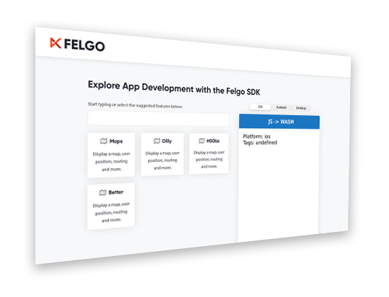
Felgo 3.7.0 adds new QML APIs to use Bluetooth LE from QML in your Qt and Felgo apps. This gives you a convenient way to use Bluetooth LE to connect to IoT, wearables and other custom devices, directly from QML, without any C++ code. This update also adds a lot of new components, features, improvements and fixes.
This blog post is the first one of a short series of posts to show you everything that is new with Felgo 3.7.0, so make sure to stay in the loop!
Important Migration Hints for Existing Projects
Felgo 3.7.0 requires existing projects to perform migration steps, depending on the used features of the SDK. Please refer to the migration section in the changelog, to see what steps are required for your projects.
Quick Overview of Felgo 3.7.0
Since this release contains a large number of new features and improvements, here is a short list of the most important changes that will be covered in more detail in this post:
- New Bluetooth LE APIs that you can use from QML with your Qt and Felgo projects
- New AppListItem as a flexible base component for lists
- New plugin to Sign in with your Apple ID
- Keychain/KeyStore access on iOS and Android for a secure key/value storage
- Share files using the native share method
- Bottom tab navigation style for Android theme
- New AppRadio component
- Improvements and fixes to AppButton and several other components
Here is a quick teaser of things that will be covered in the upcoming posts:
- The new Felgo Developer App to browse and try demos and examples
- A GitHub repository packed with open-source demos and examples
- Desktop platform support with the Felgo Cloud Builds CI/CD
- What is that up there in the clouds? Is that a rainbow? Or is it ….. an IDE?
Bluetooth LE QML API for Qt and Felgo
The Bluetooth LE protocol provides a simple and interoperable way of describing devices and services. The new Bluetooth LE QML API wraps the Qt Bluetooth Low Energy implementation to be fully available right from within QML. This provides you with a fast and simple way to integrate IoT, wearable and custom devices to your apps.

Bluetooth LE is widely used across many fields of application, such as healthcare, fitness, home automation, automotive, entertainment, security and many more. The new QML API gives you a head start to create your own apps including this feature.
Bluetooth LE QML Example
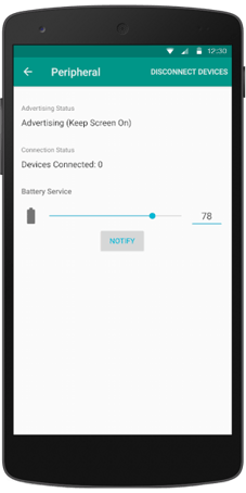
To give you a first quick look at how the new BLE QML API looks like, check out this small example of communicating with a battery service.
 |
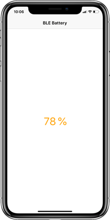 |
Here is an example of how such a Bluetooth implementation looks like:
import Felgo 3.0
import QtQuick 2.0

App {
  NavigationStack {
    Page {
      title: qsTr("BLE Battery")

      Rectangle {
        anchors.centerIn: parent
        width: parent.width * 0.6
        height: parent.height * 0.8
        radius: dp(30)
        border.color: 'black'
        border.width: dp(5)

        Rectangle {
          anchors.bottom: parent.bottom
          width: parent.width
          height: parent.height * batteryCharacteristic.value / 100
          color: batteryCharacteristic.value > 80 ? 'green' : (batteryCharacteristic.value > 30 ? 'orange' : 'red')
          radius: parent.radius
        }
      }

      AppText {
        anchors.centerIn: parent
        text: batteryCharacteristic.value + '%'
        fontSize: dp(15)
      }
    }
  }
  BluetoothLeManager {
    discoveryRunning: true

    BluetoothLeDevice{
      id: myBleDevice

      BluetoothLeService {
        uuid: 0x180F // Battery Service
        BluetoothLeCharacteristic {
          id: batteryCharacteristic
          uuid: 0x2A19 // Battery Characteristic
          dataFormat: 4 // 0x04 for uint8

          onValueChanged: {
            // Value updates
            console.log('Battery Level Changed', value)
          }
        }
      }
    }

    onDeviceDiscovered: {
      // Match device with desired service UUID
      if (device.services.indexOf('{0000180f-0000-1000-8000-00805f9b34fb}') > -1) {
        myBleDevice.setDevice(device, true)
        discoveryRunning = false
      }
    }
  }
}
If you want to quickly try this example yourself, you need 2 mobile devices. One of them needs to be an Android device in order to install the BLE Peripheral Simulator and run the Battery Service emulation. The other device will run the example above.
In the onDeviceDiscovered callback, we filter for our desired service using the UUID. This UUID is standardized for each type of service. You can find a list of such services and the associated UUIDs here.
Once they are connected, you can change the battery value on your BLE simulator and press notify. Your example app now shows the updated value.
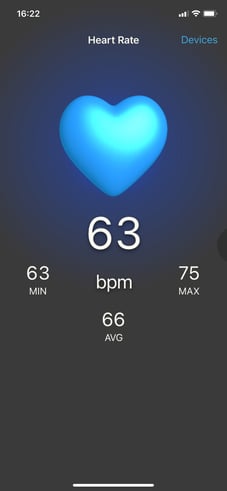
Bluetooth LE Demo App: Heart Rate Monitor
 |
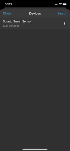 |
As another more sophisticated demo, you can check out the Bluetooth LE Heart Rate Monitor app. If you have a heart rate monitor device lying around you should do 2 things:
- Question yourself: When was the last time you went jogging?
- Fire it up and connect it to the demo app.
You can try the demo using the new Felgo Developer App, which you will learn more about in one of the following posts of this series.
Reminder: Qt on Android & iOS Training
There are a lot of pitfalls when developing mobile apps with Qt. You want to provide a native UI/UX with a consistent look on different devices and screens, use adaptive layouts to support display notches and tablet views, or integrate native Android or iOS APIs and Frameworks. Join the Qt on Android and iOS training to learn how!
AppListItem: Your New Flexible Item to Create Lists
The new AppListItem is recommended to replace the existing SimpleRow component.
Despite the name suggests, the old SimpleRow grew far from simple, with many common list features like adding images or icons. However it was not sufficient to cover some more specific use-cases in an elegant way, which required to create own list items from scratch instead.
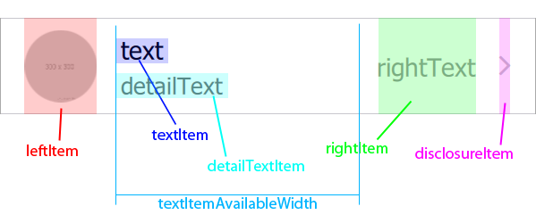
The new AppListItem offers a modular approach, which lets you replace all the default items if needed, while still allowing you to make use of the platform-native theming. The basic anatomy of the new item can be visualized like this:
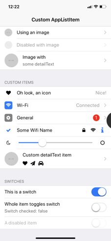
Enough of the theory, here is how it looks like:
 |
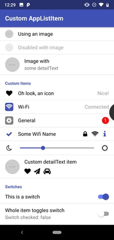 |
You can find the full example of all the list items you see above in the documentation. Here is just a small example of a very generic, and a little fancier one:
import QtQuick 2.8
import Felgo 3.0

App {
  id: app

  NavigationStack {
    Page {
      title: "Custom AppListItem"
      backgroundColor: Theme.colors.secondaryBackgroundColor

      Column {
        width: parent.width

        AppListItem {
          text: "Image with"
          detailText: "some detailText"
          image: "https://via.placeholder.com/300"
        }
        AppListItem {
          text: "Wi-Fi"
          rightText: "Connected"

          leftItem: Rectangle {
            color: Theme.colors.tintColor
            radius: dp(5)
            width: dp(26)
            height: width
            anchors.verticalCenter: parent.verticalCenter

            Icon {
              icon: IconType.wifi
              anchors.centerIn: parent
              color: "white"
            }
          }
        }
      }
    }
  }
}
The basic API of the new AppListItem is very similar to the old SimpleRow, so we recommend migrating your existing projects to the new component. This will let you benefit from improvements to both performance and layouts, and a flexible option for new requirements to your design.
We will also migrate all our existing demos to this new item soon.
Sign in with Apple - New Plugin
You can now add a "Sign in with Apple" button to your app using theApple Sign In Plugin, to comply with Apple’s guideline to provide an Apple signup option along with other social signup options.

This plugin offers you 2 new components AppleSignIn and AppleSignInButton to handle signing in with an Apple ID. Here is an example usage:
import QtQuick 2.0
import Felgo 3.0

App {
  NavigationStack {
    Page {
      title: "Apple Sign In"

      Column {
        anchors.centerIn: parent
        spacing: dp(15)

        AppleSignInButton {
          id: appleSignInButton
          anchors.horizontalCenter: parent.horizontalCenter
        }

        AppText {
          anchors.horizontalCenter: parent.horizontalCenter
          text: !appleSignInButton.enabled
                ? "Apple Sign-in unavailable."
                : appleSignInButton.appleSignIn.isLoggedIn
                ? "Signed in: " + appleSignInButton.appleSignIn.userName
                : "Click above to sign in with Apple user"
        }
      }
    }
  }
}
Native Keychain/Keystore Access to Store Data Securely on Mobile Devices
On iOS and Android, you can now make use of the native Keychain/KeyStore to store, read and delete data securely and persistently. Writing and reading of such values is straightforward using the Felgo NativeUtils:
import Felgo 3.0
import QtQuick 2.0

App {
  NavigationStack {
    Page {
      Column {
        anchors.centerIn: parent

        AppButton {
          text: "Store in Keychain"
          onClicked: nativeUtils.setKeychainValue("identifier", "123")
        }

        AppButton {
          text: "Read Keychain"
          onClicked: console.debug("Read: " + nativeUtils.getKeychainValue("identifier"))
        }

        AppButton {
          text: "Delete from Keychain"
          onClicked: nativeUtils.clearKeychainValue("identifier")
        }
      }
    }
  }
}
Share Files with the Native Share Method
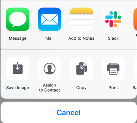
NativeUtils::share() now lets you share images and other files with other apps. Calling this function with a file url, e.g. an image, will open the share dialog with the appropriate options for the file type:
Material Bottom Navigation for Android Theme
The Android theme now offers a proper default style for bottom tab navigation. By default, Android will still use a navigation drawer, so if you want to use the bottom tabs navigation, you need to set the Navigation::navigationMode property accordingly.

The new bottom tab navigation replaces the top tab navigation if used with the Navigation component. You can still create the top tabs (also known as "segments") using the AppTabBar component.
Here is an example:
import QtQuick 2.3
import Felgo 3.0

App {
  Navigation {
    // Use tabs on Android, else default (which is tabs on iOS and drawer on desktop)
    navigationMode: Theme.isAndroid ? navigationModeTabs : navigationModeDefault
    // On Android, only the selected label is shown by default. You can change that by accessing the internal tabs or using the theming
    //tabs.showOnlySelectedLabel: false // can also be changed with Theme.navigationTabBar.showOnlySelectedLabel

    // ... add your NavigationItems here, as usual
  }
}
You can change the theming values of the bottom tab navigation on all platforms using the new Theme.navigationTabBar. This update fixes a semantic inconsistency in the theming. Both the main bottom tab navigation (using Navigation) as well as the general tabs (using AppTabBar) shared the same theme, accessible with Theme.tabBar. This resulted in potential issues when using both controls at the same time, but trying to apply different theming. With the introduction of a new style for a bottom tab navigation on Android (see detailed change above), we also split up the themes properly. You can now use Theme.navigationTabBar to style your bottom tab navigation and Theme.tabBar to style general tabs.
Note: This was previously done using Theme.tabBar, you can migrate existing projects by just replacing the theme values like this:
onInitTheme: {
  // Replace tabBar with navigationTabBar to style the bottom tab navigation
  //Theme.tabBar.titleColor = "red"
  Theme.navigationTabBar.titleColor = "red"
}
For more information, refer to the changelog.
New AppRadio Control
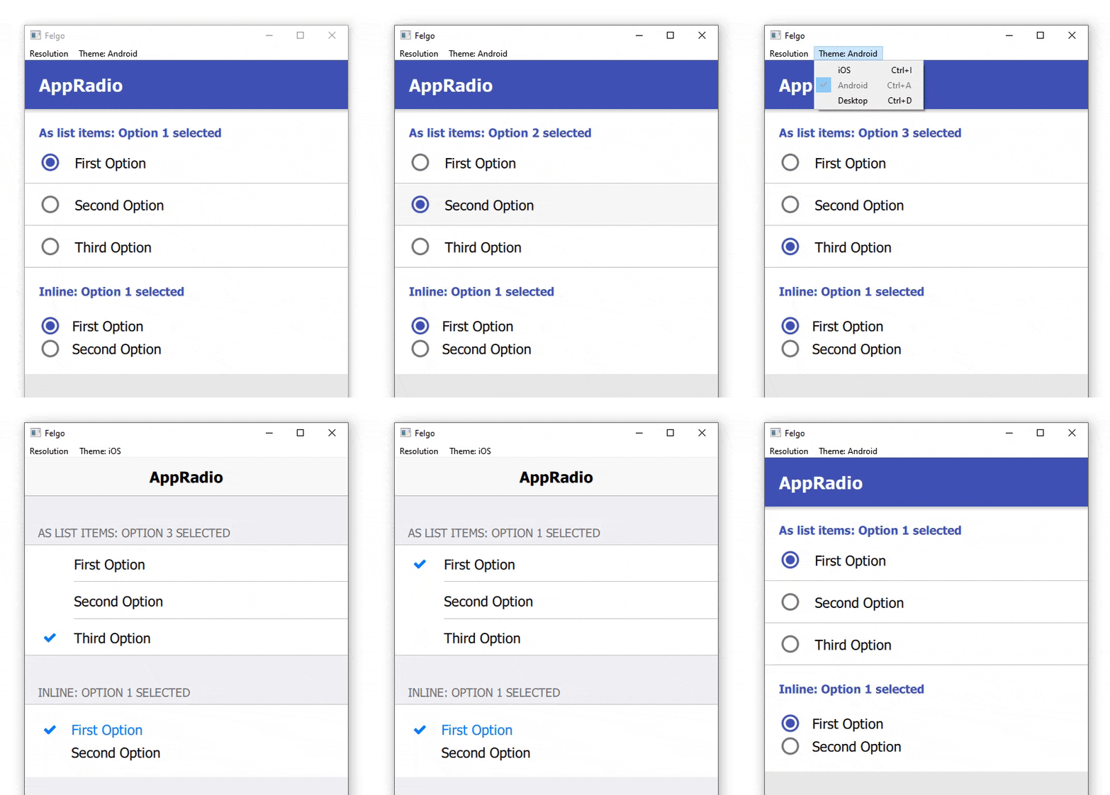
You can now use the new AppRadio control for radio selections in your apps. This control is based on the Qt Quick Controls 2 RadioButton, and adds proper default styling for use across various platforms. It allows you to follow native platform guidelines more easily, to provide your users with a familiar experience.
Here is an example of how to use the new control, and how it can be combined with the new AppListItem for a native UI/UX:
New Layout Options for AppButton
The AppButton now allows setting icons left and right of the text. Also some other customizations now got easier to apply.
Next in the Series: Everything about Demos, Examples and the new Developer App
In the next blog post, you will get a closer look at the new Developer App to browse and try examples and demos of the Felgo SDK. We also gathered the most important existing demos and examples, created many new ones, and put everything together in a GitHub repository for you to browse. Stay tuned for details about this, and much more, in the upcoming blog post.
More Features, Improvements and Fixes of Felgo 3.7.0
Felgo 3.7.0 includes many more features, for example:
- NativeUtils::safeAreaInsets is now better supported on Android. You can also use the new property Theme::safeAreaTop. It handles proper layouting in combination with Theme::statusBarStyle.
- The PullToRefreshHandler can now also be used with AppFlickable or FlickablePage items.
- You can now change the AppTextField underline color on Android easier using the AppTextField::underlineColor property.
- You can now customize the look and feel of a single NavigationBar component, independently of the global theme, with all visual properties also added to the component API. You can access the NavigationBar of a NavigationStack with the NavigationStack::navigationBar property.
- Fixes a potential crash during app shutdown when using multi-threading.
- Fixes auto-completion information for the AppCheckBox component in Qt Creator.
- Fixes a compile-time issue when using Xcode 12 (or newer) to build apps for iOS.
For all relevant changes, features and fixes of recent Felgo updates, please check out the changelog.
How to Update Felgo
Test out these new features by following these steps:
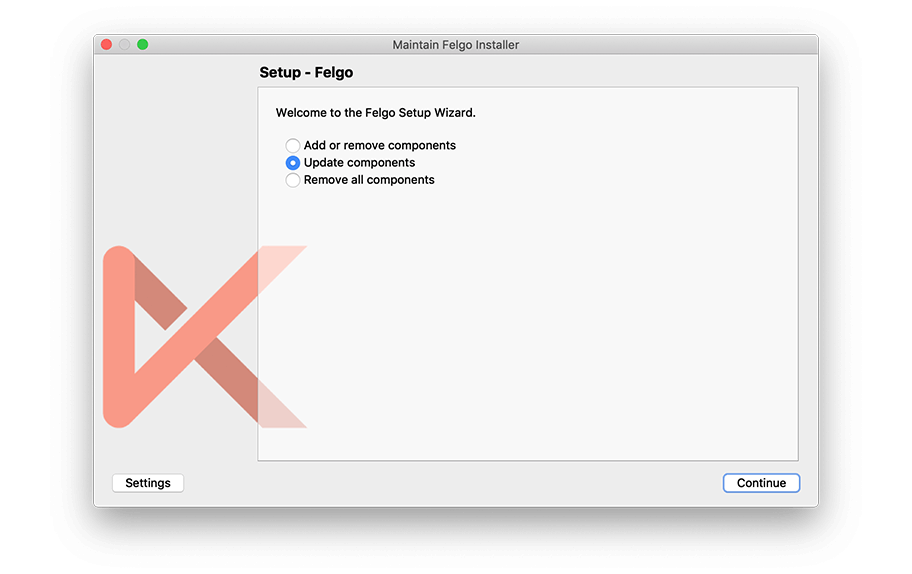
- Open the Felgo SDK Maintenance Tool in your Felgo SDK directory.
- Choose “Update components” and finish the update process to get this release as described in the Felgo Update Guide.
If you haven’t installed Felgo yet, you can do so now with the latest installer from here. Now you can explore all of the new features included in this release!
For a full list of improvements and fixes to Felgo in this update, please check out the changelog!
More Posts Like This
Release 3.6.0: Modal Dialogs and iOS Storyboard Support for Qt & Felgo
 Release 3.5.0: Run your Qt and Felgo Apps in the Browser with WebAssembly (WASM)

