
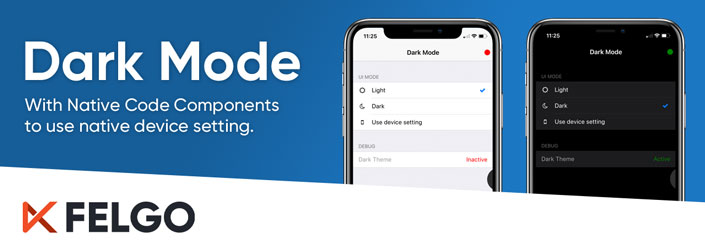
If you want to offer an exceptional user experience, one of the features to add is “Dark Mode”. For those not familiar, dark mode is a device setting, which indicates that apps should show their UI using dark colors.
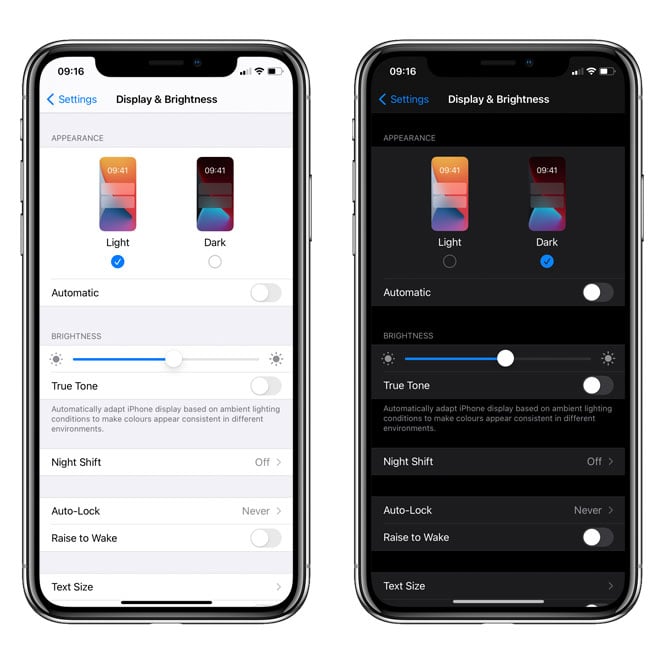
Here is an example of how this looks in the iOS settings, and how the UI adapts accordingly. If users activate dark mode, they expect their apps to also appear in a dark theme:
This blog post will guide you through the steps of introducing a dark theme in your own application. In addition, you will learn how to make use of Felgo Native Code Components, read the device settings on iOS and Android, and apply the correct theme automatically.
Our example application will then look like this:
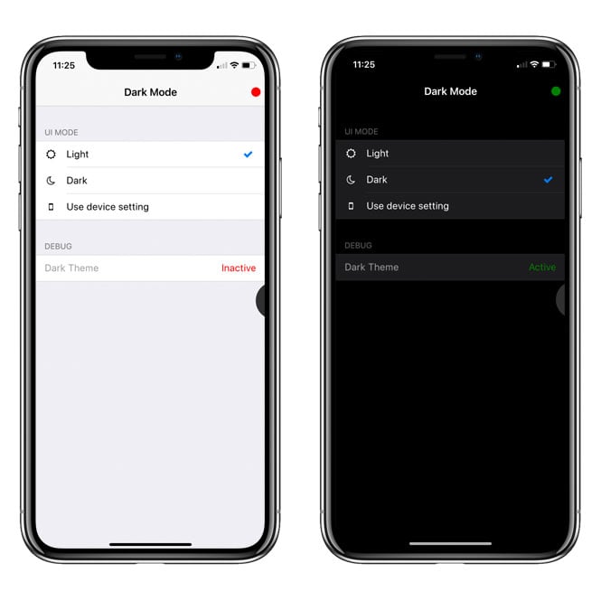
It allows the user to select a light or dark theme, or just follow the device setting. This selection is also stored persistently using a simple key/value storage.
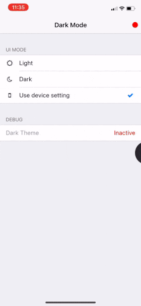
When following the device setting, the theme will be applied automatically:
The Full Dark Mode Example Source Code
Before we jump into the details, here is the full source code. You will learn more about the important parts of it in just a second. There are also a lot of code comments to help you find your way around this source code:
import QtQuick 2.7
import Qt.labs.settings 1.1 as LS // use own namespace to avoid conflicts
import Felgo 3.0

App {
  id: app

  // Indicates that dark mode is currently active
  property bool darkThemeActive: false

  onInitTheme: {
    console.debug("Init")
    // Store the default light colors of the theme
    app.storeDefaultTheme()
    // Check if dark mode is active and apply colors accordingly
    app.checkAndApplyTheme()
  }

  onApplicationResumed: {
    // Also check dark mode if app is resumed from background
    app.checkAndApplyTheme()
  }

  // Store the user selection persistently
  // This could also be done using any other local storage
  // We use labs.settings as it handles default values very conveniently
  LS.Settings {
    id: settings

    // Create a persistent property called "uiMode"
    // with a default value of "light"
    // Any change to this property is stored persistently
    // and restored on next application start
    property string uiMode: "light"
  }

  // Our app layout, with the selection of ui modes
  NavigationStack {
    Page {
      title: qsTr("Dark Mode")
      backgroundColor: Theme.colors.secondaryBackgroundColor

      // Custom navigation bar item
      rightBarItem: NavigationBarItem {
        Rectangle {
          anchors.centerIn: parent
          width: dp(15)
          height: width
          radius: width/2
          // Binding on the dark theme active property
          color: app.darkThemeActive ? "green" : "red"
        }
      }

      AppFlickable {
        id: flick
        anchors.fill: parent
        contentWidth: parent.width
        contentHeight: content.height

        Column {
          id: content
          width: parent.width

          SimpleSection {
            title: qsTr("UI Mode")
          }

          AppListItem {
            text: "Light"
            showDisclosure: false

            // We use an individual left icon for each item
            leftItem: Icon {
              icon: IconType.suno
              width: dp(20)
              anchors.verticalCenter: parent.verticalCenter
            }

            // If the item is active, we display a checkmark
            rightItem: Icon {
              icon: IconType.check
              color: Theme.colors.tintColor
              width: dp(26)
              anchors.verticalCenter: parent.verticalCenter
              visible: settings.uiMode == "light"
            }

            // If the item is pressed, we change the ui mode and store the selection
            onSelected: {
              settings.uiMode = "light"
              app.checkAndApplyTheme()
            }
          }

          AppListItem {
            text: "Dark"
            showDisclosure: false

            leftItem: Icon {
              icon: IconType.moono
              width: dp(20)
              anchors.verticalCenter: parent.verticalCenter
            }

            rightItem: Icon {
              icon: IconType.check
              color: Theme.colors.tintColor
              width: dp(26)
              anchors.verticalCenter: parent.verticalCenter
              visible: settings.uiMode == "dark"
            }

            onSelected: {
              settings.uiMode = "dark"
              app.checkAndApplyTheme()
            }
          }

          AppListItem {
            text: "Use device setting"
            showDisclosure: false
            lastInSection: true

            leftItem: Icon {
              icon: IconType.mobilephone
              width: dp(20)
              anchors.verticalCenter: parent.verticalCenter
            }

            rightItem: Icon {
              icon: IconType.check
              color: Theme.colors.tintColor
              width: dp(26)
              anchors.verticalCenter: parent.verticalCenter
              visible: settings.uiMode == "follow-system"
            }

            onSelected: {
              settings.uiMode = "follow-system"
              app.checkAndApplyTheme()
            }
          }

          SimpleSection {
            title: qsTr("Debug")
          }

          AppListItem {
            text: "Dark Theme"
            // Set text and color using a property binding
            rightText: app.darkThemeActive ? "Active" : "Inactive"
            rightTextColor: app.darkThemeActive ? "green" : "red"
            showDisclosure: false
            lastInSection: true
            enabled: false
            textColor: Theme.colors.disabledColor
          }
        }
      }
    }
  }

  // This method checks if dark mode is active and applies colors accordingly
  function checkAndApplyTheme() {
    app.darkThemeActive = checkDarkTheme(settings.uiMode)
    app.applyTheme(app.darkThemeActive)
  }

  // This methods checks it dark mode is currently active
  // Dark mode is active if either selected by the user directly
  // or if "follow-system" ui mode is selected and the native device dark mode is active
  function checkDarkTheme(mode) {
    if(mode === "light") {
      // User has selected light mode directly
      return false
    } else if(mode === "dark") {
      // User has selected dark mode directly
      return true
    } else if (mode === "follow-system") {
      // User has selected "follow-system" ui mode, so we check the device setting
      if(Qt.platform.os === "ios") {
        var uiApplicationClass = NativeObjectUtils.getClass("UIApplication")
        var application = uiApplicationClass.getStaticProperty("sharedApplication")
        var uiStyle = application.getProperty("keyWindow").getProperty("rootViewController").getProperty("traitCollection").getProperty("userInterfaceStyle")

        // UIUserInterfaceStyle.dark -> 2
        // https://developer.apple.com/documentation/uikit/uiuserinterfacestyle/dark
        return uiStyle === 2
      }
      else if(Qt.platform.os === "android") {
        var context = NativeObjectUtils.getContext()
        var configuration = context.callMethod("getResources").callMethod("getConfiguration")
        var uiMode = configuration.getProperty("uiMode")
        var uiModeNightMask = configuration.getProperty("UI_MODE_NIGHT_MASK")

        return (uiMode & uiModeNightMask) === configuration.getProperty("UI_MODE_NIGHT_YES")
      } else {
        // On other platforms than iOS and Android, we return false
        return false
      }
    }
  }

  // Apply the colors for either dark or light mode
  function applyTheme(dark) {
    if(dark) {
      // For dark mode, we use some nice dark colors
      Theme.colors.backgroundColor = "#000"
      Theme.colors.secondaryBackgroundColor = "#000"
      Theme.colors.selectedBackgroundColor = "#333"
      Theme.colors.textColor = "#fff"
      Theme.colors.dividerColor = Theme.isAndroid ? "transparent" : "#333"
      Theme.listItem.backgroundColor = "#1c1c1e"
      Theme.listItem.textColor = "#fff"
      Theme.navigationBar.backgroundColor = Theme.colors.backgroundColor
      Theme.navigationBar.titleColor = Theme.colors.textColor
      Theme.navigationBar.dividerColor = "transparent"
      Theme.colors.statusBarStyle = Theme.colors.statusBarStyleWhite
    } else {
      // For light mode, we use the stored default theme values
      Theme.colors.backgroundColor = defaultTheme.backgroundColor
      Theme.colors.secondaryBackgroundColor = defaultTheme.secondaryBackgroundColor
      Theme.colors.selectedBackgroundColor = defaultTheme.selectedBackgroundColor
      Theme.colors.textColor = defaultTheme.textColor
      Theme.colors.dividerColor = defaultTheme.dividerColor
      Theme.listItem.backgroundColor = defaultTheme.listItemBackgroundColor
      Theme.listItem.textColor = defaultTheme.listItemTextColor
      Theme.navigationBar.backgroundColor = defaultTheme.navigationBarBackgroundColor
      Theme.navigationBar.titleColor = defaultTheme.navigationBarTitleColor
      Theme.navigationBar.dividerColor = defaultTheme.navigationBarDividerColor
      Theme.colors.statusBarStyle = Theme.isAndroid ? Theme.colors.statusBarStyleWhite : Theme.colors.statusBarStyleBlack
    }
  }

  // Store the default light theme values, as they would be overwritten by dark mode
  function storeDefaultTheme() {
    defaultTheme.backgroundColor = Theme.colors.backgroundColor
    defaultTheme.secondaryBackgroundColor = Theme.colors.secondaryBackgroundColor
    defaultTheme.selectedBackgroundColor = Theme.colors.selectedBackgroundColor
    defaultTheme.textColor = Theme.colors.textColor
    defaultTheme.dividerColor = Theme.colors.dividerColor
    defaultTheme.listItemBackgroundColor = Theme.listItem.backgroundColor
    defaultTheme.listItemTextColor = Theme.listItem.textColor
    defaultTheme.navigationBarBackgroundColor = Theme.navigationBar.backgroundColor
    defaultTheme.navigationBarTitleColor = Theme.navigationBar.titleColor
    defaultTheme.navigationBarDividerColor = Theme.navigationBar.dividerColor
  }

  // Simple storage object for our default theme values of the light mode
  QtObject {
    id: defaultTheme

    property color backgroundColor
    property color secondaryBackgroundColor
    property color selectedBackgroundColor
    property color textColor
    property color dividerColor
    property color listItemBackgroundColor
    property color listItemTextColor
    property color navigationBarBackgroundColor
    property color navigationBarTitleColor
    property color navigationBarDividerColor
  }
}
Access Native Dark Mode Setting on iOS and Android
First, we will look at the most advanced functionality of this example, which is reading the native device setting. This is important to offer the user a seamless experience with his other apps and general device appearance.
With Felgo, you can make use of the Native Code Components to run native code and access native iOS and Android device features right from QML.
Here is the specific piece of code we are looking at now:
 // This methods checks it dark mode is currently active
 // Dark mode is active if either selected by the user directly
 // or if "follow-system" ui mode is selected and the native device dark mode is active
 function checkDarkTheme(mode) {
   if(mode === "light") {
     // User has selected light mode directly
     return false
   } else if(mode === "dark") {
     // User has selected dark mode directly
     return true
   } else if (mode === "follow-system") {
     // User has selected "follow-system" ui mode, so we check the device setting
     if(Qt.platform.os === "ios") {
       var uiApplicationClass = NativeObjectUtils.getClass("UIApplication")
       var application = uiApplicationClass.getStaticProperty("sharedApplication")
       var uiStyle = application.getProperty("keyWindow").getProperty("rootViewController").getProperty("traitCollection").getProperty("userInterfaceStyle")

       // UIUserInterfaceStyle.dark -> 2
       // https://developer.apple.com/documentation/uikit/uiuserinterfacestyle/dark
       return uiStyle === 2
     }
     else if(Qt.platform.os === "android") {
       var context = NativeObjectUtils.getContext()
       var configuration = context.callMethod("getResources").callMethod("getConfiguration")
       var uiMode = configuration.getProperty("uiMode")
       var uiModeNightMask = configuration.getProperty("UI_MODE_NIGHT_MASK")

       return (uiMode & uiModeNightMask) === configuration.getProperty("UI_MODE_NIGHT_YES")
     } else {
       // On other platforms than iOS and Android, we return false
       return false
     }
   }
 }
The mode parameter passed to this function is the selection of the user in the example app. It is one of these options:
- “light”→ Light theme is selected by the user, the dark theme is inactive, return false
- “dark” → Dark theme is selected by the user, the dark theme is active, return true
- “follow-system” → Use the device setting to determine if the dark theme is active and return true/false accordingly
Access Dark Mode Setting on iOS
On iOS, the dark mode setting is reflected by the userInterfaceStyle property. The value of this property is of type UIUserInterfaceStyle, which is an enum with the following values:
You can find the integer values of the enums in the iOS documentation of each of the values. Tip: Toggle the language to Swift in the iOS documentation to see the integer values of enums.
Here is an example of how to access this property using Swift:
class MyViewController: UIViewController {

    override func viewDidLoad() {
        super.viewDidLoad()

        if self.traitCollection.userInterfaceStyle == .dark {
            // User Interface is Dark
        } else {
            // User Interface is Light
        }

    }

    // ...
}
To access the same property with Felgo, you’ll have to access the properties in a similar way. With Felgo Native Code Component, you can access iOS properties and methods using their Objective-C identifiers, which sometimes slightly differ from their Swift counterparts. So make sure you have the iOS documentation set to “Objective-C” in the top right corner.
First, we need an object of type UIViewController. This class conforms to the UITraitEnvironment and offers a traitCollection property of type UITraitCollection, that contains our desired userInterfaceStyle property.
You can access a UIViewController object via the window, like this:
// Get the application class ...
var uiApplicationClass = NativeObjectUtils.getClass("UIApplication")
// … and access the static property to get the application object
var application = uiApplicationClass.getStaticProperty("sharedApplication")
// Get the window of the application and access the rootViewController
var viewController = application.getProperty("keyWindow").getProperty("rootViewController")
As you can see, you obtain the sharedApplication of type UIApplication and access the keyWindow of type UIWindow. This window offers you access to the rootViewController.
In the full example above, we also access the userInterfaceStyle immediately, like this:
var uiStyle = application.getProperty("keyWindow").getProperty("rootViewController").getProperty("traitCollection").getProperty("userInterfaceStyle")
Now you only need to check against the correct value of this style. As mentioned above, the dark mode equals an enum with the value 2. So only if the style value is 2, we return true, and false in any other case:
return uiStyle === 2
Access Dark Mode Setting on Android
On Android, you can access the dark mode setting using the uiMode property. This one must be checked using a specific mask.
So first, we’ll have to get our hands on this uiMode and the mask. Both are part of the Configuration resource. You can obtain this configuration using the Resources, accessible via the Android Context. Here is how to do this:
// Get the Android context
var context = NativeObjectUtils.getContext()
// Get the resources object, and then the configuration object
var configuration = context.callMethod("getResources").callMethod("getConfiguration")
The Android documentation is great because it often gives great hints on how to access a specific class. For example, looking at the Configuration documentation, second paragraph:

Now that we have acquired the Configuration from the Resources, we can get the uiMode and the mask, like this:
var uiMode = configuration.getProperty("uiMode")
var uiModeNightMask = configuration.getProperty("UI_MODE_NIGHT_MASK")
All that is left is to combine the mode with the mask, and check if the result is the desired dark mode:
return (uiMode & uiModeNightMask) === configuration.getProperty("UI_MODE_NIGHT_YES")
The mask is applied using the so-called “bitwise AND operator”, a single & sign. Only if the result equals UI_MODE_NIGHT_YES, we return true, and false in any other case.
Apply a Dark Theme to your App with Felgo
You have several options to apply dark colors to your app controls. One is to apply the colors directly at any control. A more convenient way is using the global theme. To restore the default values of this theme when you switch back to the light colors, you can store the default values.
Here is how this is done in our example:
 // This method checks if dark mode is active and applies colors accordingly
 function checkAndApplyTheme() {
   app.darkThemeActive = checkDarkTheme(settings.uiMode)
   app.applyTheme(app.darkThemeActive)
 }

 // Apply the colors for either dark or light mode
 function applyTheme(dark) {
   if(dark) {
     // For dark mode, we use some nice dark colors
     Theme.colors.backgroundColor = "#000"
     Theme.colors.secondaryBackgroundColor = "#000"
     Theme.colors.selectedBackgroundColor = "#333"
     Theme.colors.textColor = "#fff"
     Theme.colors.dividerColor = Theme.isAndroid ? "transparent" : "#333"
     Theme.listItem.backgroundColor = "#1c1c1e"
     Theme.listItem.textColor = "#fff"
     Theme.navigationBar.backgroundColor = Theme.colors.backgroundColor
     Theme.navigationBar.titleColor = Theme.colors.textColor
     Theme.navigationBar.dividerColor = "transparent"
     Theme.colors.statusBarStyle = Theme.colors.statusBarStyleWhite
   } else {
     // For light mode, we use the stored default theme values
     Theme.colors.backgroundColor = defaultTheme.backgroundColor
     Theme.colors.secondaryBackgroundColor = defaultTheme.secondaryBackgroundColor
     Theme.colors.selectedBackgroundColor = defaultTheme.selectedBackgroundColor
     Theme.colors.textColor = defaultTheme.textColor
     Theme.colors.dividerColor = defaultTheme.dividerColor
     Theme.listItem.backgroundColor = defaultTheme.listItemBackgroundColor
     Theme.listItem.textColor = defaultTheme.listItemTextColor
     Theme.navigationBar.backgroundColor = defaultTheme.navigationBarBackgroundColor
     Theme.navigationBar.titleColor = defaultTheme.navigationBarTitleColor
     Theme.navigationBar.dividerColor = defaultTheme.navigationBarDividerColor
     Theme.colors.statusBarStyle = Theme.isAndroid ? Theme.colors.statusBarStyleWhite : Theme.colors.statusBarStyleBlack
   }
 }

 // Store the default light theme values, as they would be overwritten by dark mode
 function storeDefaultTheme() {
   defaultTheme.backgroundColor = Theme.colors.backgroundColor
   defaultTheme.secondaryBackgroundColor = Theme.colors.secondaryBackgroundColor
   defaultTheme.selectedBackgroundColor = Theme.colors.selectedBackgroundColor
   defaultTheme.textColor = Theme.colors.textColor
   defaultTheme.dividerColor = Theme.colors.dividerColor
   defaultTheme.listItemBackgroundColor = Theme.listItem.backgroundColor
   defaultTheme.listItemTextColor = Theme.listItem.textColor
   defaultTheme.navigationBarBackgroundColor = Theme.navigationBar.backgroundColor
   defaultTheme.navigationBarTitleColor = Theme.navigationBar.titleColor
   defaultTheme.navigationBarDividerColor = Theme.navigationBar.dividerColor
 }

 // Simple storage object for our default theme values of the light mode
 QtObject {
   id: defaultTheme

   property color backgroundColor
   property color secondaryBackgroundColor
   property color selectedBackgroundColor
   property color textColor
   property color dividerColor
   property color listItemBackgroundColor
   property color listItemTextColor
   property color navigationBarBackgroundColor
   property color navigationBarTitleColor
   property color navigationBarDividerColor
 }
The first method applyTheme uses a parameter that indicates if the dark or the light colors should be applied. The result of our checkDarkTheme method that we described above will be used here. For the dark colors, we chose a nice set of colors. For the light colors, we restore the default values of the theme. If you also use custom colors for the light theme, you could apply them here directly or store them together with the default values.
The second method storeDefaultTheme stores the values for the light theme. For this, we use the custom defaultTheme object that you can see at the end of the code block above. The reason why we use so-called “imperative assignment” in a function to store the default values is simple and explained in the comment here:
QtObject {
  id: defaultTheme

  // If we create a property binding like this, as soon as we set a dark color to Theme.colors.backgroundColor,
  // this binding would also update and overwrite the default value.
  // Thus we need to avoid creating a property binding in the first place
  property color backgroundColor: Theme.colors.backgroundColor
}
Now that you have methods to store the default values, and apply a dark or light theme to your app, you only have to make use of them. The first place to do so is the application start:
App {
 id: app

 // Indicates that dark mode is currently active
 property bool darkThemeActive: false

 onInitTheme: {
   // Store the default light colors of the theme
   app.storeDefaultTheme()
   // Check if dark mode is active and apply colors accordingly
   app.checkAndApplyTheme()
 }

 // … remaining example code
}
On application start, we immediately store the default theme values, to be able to restore them if the app switches to the light theme later.
Then we check if the dark theme should be applied. Remember the settings.uiMode property passed to the function is either “light”, “dark” or “follow-system”. This property equals the selection of the user in our example app.
Based on this selection, and in the case of “follow-system” based on the native device setting, we apply the light or dark theme.
Since the light and dark theme can also change while the app is in the background, or in this example if the user changes the selection, only checking this at application start is not sufficient:
App {
 id: app

 // Indicates that dark mode is currently active
 property bool darkThemeActive: false

 onInitTheme: {
   // Store the default light colors of the theme
   app.storeDefaultTheme()
   // Check if dark mode is active and apply colors accordingly
   app.checkAndApplyTheme()
 }

 onApplicationResumed: {
   // Also check dark mode if app is resumed from background
   app.checkAndApplyTheme()
 }

 // Store the user selection persistently
 // This could also be done using any other local storage
 // We use labs.settings as it handles default values very conveniently
 LS.Settings {
   id: settings

   // Create a persistent property called "uiMode"
   // with a default value of "light".
   // Any change to this property is stored persistently
   // and restored on next application start
   property string uiMode: "light"
 }

 // …

}
Additionally, you have to check and apply the theme whenever the application is resumed (from the background) and whenever the selected uiMode changes. This uiMode is updated when the user selects one of the options in our example app.
We chose the Qt.labs.settings module for the persistent Settings component in this example, because it is very convenient to use. Any change to the defined uiMode property is persisted and restored on the next app start. If no value is stored yet, it defaults to the “light” value. Note that we used an own namespace “LS” (defined at the import) to avoid any name conflicts with other modules.
The uiMode is changed by the user selection. As a reference, here is one of the options:
         AppListItem {
           text: "Light"
           showDisclosure: false

           // We use an individual left icon for each item
           leftItem: Icon {
             icon: IconType.suno
             width: dp(20)
             anchors.verticalCenter: parent.verticalCenter
           }

           // If the item is active, we display a checkmark
           rightItem: Icon {
             icon: IconType.check
             color: Theme.colors.tintColor
             width: dp(26)
             anchors.verticalCenter: parent.verticalCenter
             visible: settings.uiMode == "light"
           }

           // If the item is pressed, we change the ui mode and store the selection
           onSelected: {
             settings.uiMode = "light"
             app.checkAndApplyTheme()
           }
         }
Similar to the other options, this example uses a simple AppListItem, with an icon on the left and a checkmark on the right if this item is the current active uiMode. If the item is pressed, we change the current uiMode.
This wraps up the example. You can also try it in the Felgo Web Editor!
We recommend adding support for dark mode in your Felgo or Qt application as well, to offer the best experience for your users. Felgo Native Code Components allow you to seamlessly align with native device settings.
Get Felgo Native Code Components
Benefits of using QML Native Code Components
You can benefit from Native Components in your Qt and Felgo apps in several ways:
- Save Time and Code: Integration of native features for iOS and Android is complex and usually involves different languages like QML, C++, Java, and Obj-C. Use native components for seamless access to platform features without adding boilerplate code for wrapping native APIs.
- Cross-Platform by Default: You can add distinct native code for each platform. Native components automatically choose the respective implementation and thus allow for cross-platform usage in QML.
- Direct Access to New APIs: When new versions of Android and iOS get released, all new features are immediately available. There is no need to wait for Qt or Felgo to "catch up".
- Use Existing Native Documentation: No need to learn any new APIs. With the Native Code Components, you reuse existing resources for native iOS and Android development.
- Migrate Existing Applications: Together with Native App Integration, the QML Native Code Components give total flexibility when mixing Qt with native technologies. Native App Integration embeds Qt views in iOS or Android apps. Native Components can be used to embed iOS or Android views in Qt Quick.
More Posts like This
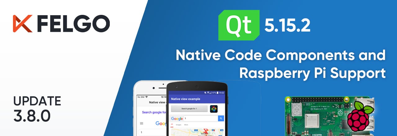
Release 3.8.0: Call Native APIs from QML with JavaScript, Build for the Raspberry Pi and Update to Qt 5.15.2

Felgo Cloud IDE: Enhance your Qt Development with Lifecycle Management and Develop Qt & QML Online

Felgo's YouTube Channel for Qt: Watch the Best Talks, Felgo Webinars and Qt/QML Tutorials


